Your project’s front page is its digital handshake. It’s the first thing users see, and it often determines whether they stay to explore or leave within seconds. Crafting the best front page design for your project isn’t just about aesthetics; it’s about creating a clear, intuitive, and persuasive experience that guides visitors toward a specific goal. Whether you’re launching a new app, a SaaS platform, or an online portfolio, getting the homepage right is critical for success.
- What You’ll Learn
- 1. Why Your Front Page Design is So Important
- 2. The Key Elements of an Effective Front Page
- 3. Best Practices for Your Project Homepage Layout
- 4. Choosing the Right Colour Schemes and Typography
- 5. Incorporating Visuals: The Power of Images and Videos
- 6. The Necessity of Responsive Design
- 7. Prioritising User Experience (UX)
- 8. Building for Everyone: Accessibility in Design
- 9. Examples of Successful Front Page Designs
- 10. Tools and Resources for Designing Your Front Page
- 11. SEO Considerations for Your Front Page
- 12. Testing and Iterating Your Design
- Frequently Asked Questions (FAQ)
- How can I make my project’s front page look more attractive?
- What are common front page design mistakes to avoid?
- What makes a project’s front page design effective?
- What software is best for designing front pages?
- Conclusion
This guide breaks down the essential principles you need to know.
This article focuses on digital projects like websites and applications. While some principles apply broadly, our main focus is on creating an effective online presence, not physical school project covers. We’ll explore everything from core layout strategies and user experience to the best tools for bringing your vision to life.
What You’ll Learn
- First Impressions Matter: Your front page design establishes credibility and trust in under a second. A professional design can significantly lower bounce rates.
- Clarity is King: An effective front page clearly communicates what your project is, who it’s for, and what action the user should take next.
- Mobile-First is Non-Negotiable: With over half of all web traffic coming from mobile devices, a responsive design that looks great on any screen is essential.
- UX and Accessibility are Crucial: A good design is one that is easy and pleasant for everyone to use, including people with disabilities.
- Tools Can Accelerate Your Success: Powerful landing page builders and SEO tools can help you design, test, and optimise your front page without needing to write code.
1. Why Your Front Page Design is So Important
The front page of your digital project is arguably its most important asset. It serves as the main entry point for the majority of your visitors, setting the tone for their entire experience. A poorly designed homepage can confuse or frustrate users, causing them to leave before they ever see the value you offer. Statistics consistently show that it takes users about 50 milliseconds (that’s 0.05 seconds) to form an opinion about your website that determines whether they’ll stay or leave.
An effective front page design does more than just look good. It builds immediate trust and credibility. A clean, modern, and professional layout signals that you are a serious and trustworthy organisation. Conversely, an outdated or cluttered design can make your project seem unprofessional or even insecure, driving potential customers away.
This initial impression is powerful and can be difficult to reverse.
Furthermore, the front page is your primary tool for communication and conversion. It’s where you articulate your unique value proposition—what your project does and why it’s better than the alternatives. It guides users through their journey, directing them to key information, features, or a call-to-action (CTA). A well-structured design can dramatically increase user engagement, lead generation, and ultimately, sales.
2. The Key Elements of an Effective Front Page
Every successful front page is built from a combination of core components that work together to inform and persuade visitors. Understanding these elements is the first step toward creating a design that works. While the exact implementation will vary, a top project page design almost always includes these fundamental building blocks.
- Compelling Headline and Sub-headline: This is the first text your visitors will read. The headline should grab their attention and clearly state the main benefit of your project in a few powerful words. The sub-headline provides a brief, one-sentence explanation that expands on the headline, offering a little more detail about what you do or who you serve.
- Clear Call-to-Action (CTA): What is the single most important action you want a visitor to take? Whether it’s “Sign Up for Free,” “Request a Demo,” or “Buy Now,” your primary CTA should be impossible to miss. Use a contrasting colour for the button and action-oriented text.
- Engaging Visuals (Hero Shot): A large, high-quality image, illustration, or video at the top of the page (the “hero section”) can communicate value much faster than text alone. This visual should be relevant, showing your product in action or evoking the positive emotion associated with solving the user’s problem.
- Simple Navigation: Your main navigation menu should be intuitive and uncluttered. Limit the number of top-level menu items to the essentials (e.g., Features, Pricing, About, Contact). The goal is to help users find what they’re looking for without overwhelming them.
- Social Proof: People trust other people. Including testimonials, customer logos, case study snippets, or user reviews builds instant credibility. It shows visitors that others have used and found value in your project, reducing their perceived risk.
- Benefits and Features: While it’s tempting to list every feature, it’s more effective to focus on the benefits. How does your project make the user’s life better, easier, or more productive? Frame your features within the context of the value they deliver to the user.
3. Best Practices for Your Project Homepage Layout

Once you know the key elements, the next step is arranging them effectively. The best project homepage layout is one that guides the user’s eye naturally through the content, creating a logical and intuitive flow. Several established design principles can help you achieve this.
First, consider the visual hierarchy. This is the principle of arranging elements to show their order of importance. Your most critical element—usually your headline and CTA—should be the most prominent. You can achieve this through size, colour, contrast, and placement.
For example, a large headline in a bold font placed at the top of the page will naturally draw more attention than smaller text further down.
Next, think about common scanning patterns. Research shows that users often scan web pages in an “F-pattern” or a “Z-pattern.” In the F-pattern, users read horizontally across the top, then scan down the left side of the page, occasionally reading across a second horizontal line. In the Z-pattern, the eye moves from top-left to top-right, then diagonally down to the bottom-left, and finally across to the bottom-right. Placing your most important elements along these natural eye paths can increase the chances they get seen.
Finally, don’t underestimate the power of white space (or negative space). This is the empty area around your design elements. Ample white space prevents your page from feeling cluttered and overwhelming. It helps separate different sections, improves readability, and allows your key elements to stand out.
A common mistake is trying to fill every pixel with information; a good layout breathes and gives users the mental space to process what they’re seeing.
4. Choosing the Right Colour Schemes and Typography
Colour and typography are the soul of your design. They evoke emotion, convey personality, and have a significant impact on readability and user experience. Choosing them thoughtfully is essential for creating an effective front page design that resonates with your target audience.
Your colour palette should align with your brand’s identity and the message you want to convey. Colours have psychological associations; for example, blue often suggests trust and professionalism (common in tech and finance), while green can imply growth and nature. A good practice is to follow the 60-30-10 rule: 60% of your space should be a dominant brand colour, 30% a secondary colour, and 10% an accent colour. The accent colour is perfect for your CTAs, as it makes them pop against the background.
When selecting colours, you must also consider accessibility. Ensure there is sufficient contrast between your text and its background. Tools like the WebAIM Contrast Checker can help you verify that your colour combinations meet the Web Content Accessibility Guidelines (WCAG) standards, making your site usable for people with visual impairments.
Typography is just as important. Your choice of fonts affects readability and sets the tone. A good rule of thumb is to use no more than two or three fonts on your entire site to maintain consistency. Choose a clear, legible font for body text (e.g., Open Sans, Lato, Roboto) and a more distinctive font for headlines.
Ensure your font size is large enough to be read comfortably on all devices—16px is a common baseline for body text. Proper line spacing (leading) and letter spacing (kerning) also contribute to a much better reading experience.
5. Incorporating Visuals: The Power of Images and Videos
Visual content can communicate complex ideas in an instant and create a strong emotional connection with your audience. A front page without compelling visuals can feel sterile and uninviting. The key is to use images and videos strategically to support your message, not just for decoration.
Your hero section is the prime location for a powerful visual. A high-quality, custom photograph of your product in use or a short, auto-playing background video can be incredibly effective. Avoid generic stock photos if possible, as they can feel inauthentic and cheapen your brand. If you must use stock imagery, choose photos that look natural and align closely with your brand’s aesthetic.
Videos are particularly engaging. A short explainer video (30-90 seconds) can quickly demonstrate how your project works and highlight its key benefits. Placing this video prominently on your front page can significantly increase conversion rates, as many users prefer watching a video to reading a long block of text. You can embed a video directly or use a thumbnail with a play button to avoid slowing down your page’s initial load time.
Here is a great overview of creating stunning front page designs:
Beyond the hero section, use icons and illustrations to break up text and visually explain features. Icons provide quick visual cues that make content easier to scan. Custom illustrations can add a unique personality to your brand that sets you apart from competitors. Whatever visuals you choose, make sure they are optimised for the web to ensure fast loading times, as large, uncompressed images are a primary cause of slow websites.
6. The Necessity of Responsive Design
In today’s multi-device world, responsive design is no longer a feature—it’s a fundamental requirement. A responsive front page automatically adjusts its layout to provide an optimal viewing experience on any device, from a large desktop monitor to a small mobile phone. With more than half of all internet traffic now coming from mobile devices, a non-responsive site is effectively alienating a huge portion of its potential audience.
A mobile-first approach is the modern standard for responsive design. This means you design the mobile layout first and then adapt it for larger screens. This forces you to prioritise the most essential content and functionality, resulting in a cleaner, more focused design across all devices. It helps you avoid the common pitfall of trying to cram a complex desktop layout onto a tiny screen.
Key components of responsive design include a fluid grid system, flexible images, and CSS media queries. A fluid grid uses relative units like percentages instead of fixed units like pixels, allowing the layout to stretch or shrink with the screen size. Flexible images are also sized in relative units to prevent them from breaking the layout. Media queries are CSS rules that apply different styles based on the characteristics of the device, such as its width, height, or orientation.
Together, these techniques ensure your best project homepage layout looks and works great everywhere.
Pro Tip: Don’t just rely on resizing your browser window on a desktop to test responsiveness. Use your browser’s developer tools to emulate different devices (like iPhones, iPads, and Android phones) to get a more accurate picture of the user experience. Better yet, test on actual physical devices.
7. Prioritising User Experience (UX)
User experience (UX) is the overall feeling a person has when interacting with your project. A great front page design is one that is not only visually appealing but also easy, intuitive, and enjoyable to use. Poor UX is a major reason why users abandon a site.
One of the most critical UX factors is page load speed. Users are impatient. If your page takes more than a few seconds to load, many will leave before it even finishes rendering. You can improve your page speed by optimising images, minifying CSS and JavaScript files, and using a good hosting provider.
Tools like Google PageSpeed Insights can analyse your page and give you actionable recommendations for improvement.
Intuitive navigation is another cornerstone of good UX. Users should be able to find what they’re looking for without thinking too hard. This means having a clear menu structure, descriptive labels, and a logical information architecture. The “three-click rule,” which suggests users should be able to find any information within three clicks, is a helpful guideline for keeping your navigation simple and efficient.
Finally, your messaging must be crystal clear. Avoid jargon and marketing fluff. Use simple, direct language that your target audience will understand. Your value proposition, features, and calls-to-action should be communicated so clearly that a first-time visitor immediately understands what your project is about and what they are supposed to do next.
A design that prioritises clarity over cleverness will almost always perform better.
8. Building for Everyone: Accessibility in Design
Accessibility means designing your front page so that it can be used by everyone, including people with disabilities such as visual, auditory, motor, or cognitive impairments. It’s not just a matter of compliance or social responsibility; it’s a core component of good design that benefits all users.
An accessible design is often a more usable design for everyone. For example, providing high colour contrast between text and background helps users with low vision, but it also improves readability for all users in bright sunlight. Providing alternative text (alt text) for images allows screen readers to describe the image to visually impaired users, but it also helps search engines understand your content and displays if an image fails to load.
Key principles of accessible design, as outlined in the Web Content Accessibility Guidelines (WCAG), include:
- Perceivable: Information must be presentable to users in ways they can perceive. This includes providing alt text for images and captions for videos.
- Operable: Users must be able to operate the interface. This means the entire site should be navigable using only a keyboard, without requiring a mouse.
- Understandable: The information and the operation of the user interface must be understandable. This relates to using clear language and providing predictable, consistent navigation.
- Robust: Content must be robust enough that it can be interpreted reliably by a wide variety of user agents, including assistive technologies like screen readers.
Implementing accessibility from the start is far easier than trying to retrofit it later. It ensures you’re creating a welcoming and inclusive experience, broadening your potential audience and strengthening your brand’s reputation.
9. Examples of Successful Front Page Designs
Studying successful designs is one of the best ways to understand what works. Let’s look at a few examples of companies that have nailed their top project page design.
Slack: Slack’s homepage is a masterclass in clarity and benefit-oriented messaging. The headline is simple and powerful, immediately communicating its core value. The hero section often features a clean, dynamic illustration or animation that shows teams collaborating. The primary CTA is bright and prominent, and social proof from major companies is displayed clearly just below the fold.
The entire page uses a simple colour scheme and generous white space, making it feel organised and easy to digest.
Dropbox: Dropbox’s front page focuses on a single, clear objective: getting you to sign up or sign in. The design is minimalist, with a concise headline that speaks directly to a user’s need for organisation and focus. The hero visual is often an abstract, calming graphic that reinforces the brand’s message of simplicity and control. By removing all unnecessary distractions, Dropbox guides the user directly toward the desired action.
Mailchimp: Mailchimp is known for its friendly and approachable brand personality, and its homepage reflects this perfectly. It uses a unique illustrative style and a warm, encouraging tone of voice. The headline clearly states who the product is for and what it helps them achieve. The layout is clean and guides the user through the key benefits and features with a mix of short text and playful visuals.
Their design proves that a professional front page can also have a lot of personality.
These examples show that while the specifics may differ, the best designs all share common traits: clarity, a strong visual hierarchy, a focus on benefits, and a clear path to conversion.
10. Tools and Resources for Designing Your Front Page
You don’t need to be a professional designer or developer to create a stunning front page. A wide range of powerful tools can help you build and optimise your design without writing a single line of code. These platforms are particularly useful for marketers, entrepreneurs, and small teams who need to move quickly.
Landing page builders are an excellent choice for creating high-converting front pages. They offer drag-and-drop editors, professionally designed templates, and built-in features for A/B testing and analytics.
Here are some of the best options available:
Leadpages
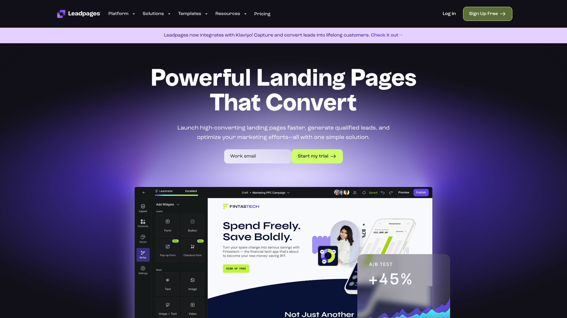
Leadpages is known for its focus on conversion optimisation. It offers a vast library of mobile-responsive templates designed for specific goals, such as lead generation or webinar sign-ups. Its drag-and-drop builder is intuitive, and it includes a unique “Leadmeter” that provides real-time feedback on your page’s likely performance.
Pros:
- Excellent selection of high-converting templates.
- Built-in conversion guidance and analytics.
- Integrates easily with a wide range of marketing tools.
Cons:
- The standard builder has some customisation limits compared to others.
- Can be more expensive than basic website builders.
Unbounce
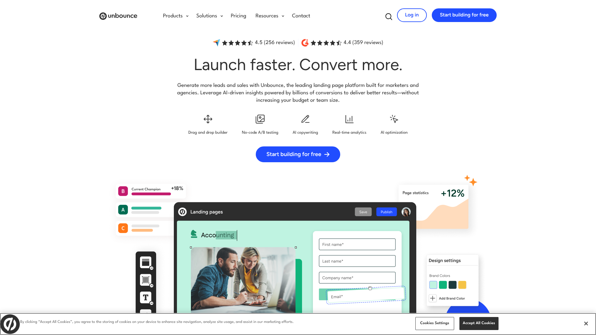
Unbounce is a powerful and flexible platform aimed at marketers who need full creative control. Its pixel-perfect drag-and-drop editor allows you to place any element anywhere on the page. Unbounce also has advanced features like Dynamic Text Replacement for personalising pages for PPC campaigns and AI-powered tools for copy generation and smart traffic routing.
Pros:
- Complete design freedom with the classic builder.
- Powerful AI and personalisation features.
- Robust A/B testing capabilities.
Cons:
- Steeper learning curve than simpler tools.
- Pricing is on the higher end, geared toward businesses.
Instapage
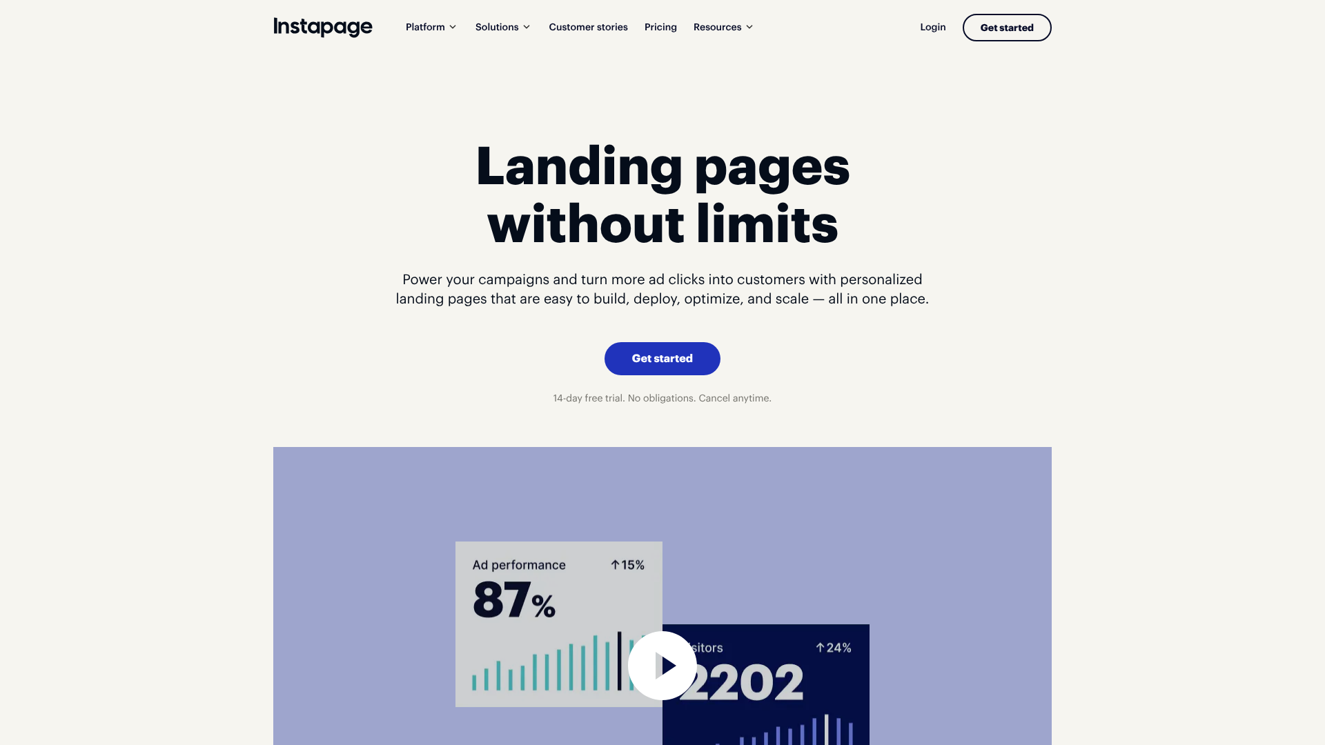
Instapage excels at creating personalised landing pages at scale, making it a favourite for enterprise teams and advertising agencies. It offers features like AdMap for connecting ads to relevant post-click pages, built-in collaboration tools, and lightning-fast page speeds with its Thor Render Engine. It’s a premium solution for teams serious about maximising their advertising ROI.
Pros:
- Advanced personalisation and advertising integration features.
- Excellent for team collaboration.
- Extremely fast page load speeds.
Cons:
- The most expensive option of the three.
- May be overkill for individuals or small businesses.
| Feature | Leadpages | Unbounce | Instapage |
|---|---|---|---|
| Best For | Small businesses & entrepreneurs | Marketers & agencies | Enterprise & ad teams |
| Ease of Use | Very easy | Moderate | Moderate |
| Key Feature | Conversion-focused templates | AI Smart Traffic & DTR | AdMap & Personalisation |
| Pricing | $$ | $$$ | $$$$ |
11. SEO Considerations for Your Front Page
An amazing front page is useless if no one can find it. Search Engine Optimisation (SEO) is the practice of optimising your site to rank higher in search engine results for relevant queries. Your front page is often the most authoritative page on your site, so getting its on-page SEO right is critical.
Start with the basics: your title tag and meta description. The title tag is the clickable headline that appears in search results, and it’s a major ranking factor. It should include your brand name and your primary target keyword. The meta description is the short snippet of text below the title; while not a direct ranking factor, a compelling description can significantly improve your click-through rate.
Your heading structure is also important. You should have one, and only one, H1 tag on your page. This is your main headline and should clearly describe the page’s content, incorporating your main keyword. Use H2 and H3 tags to structure the rest of your content logically, which helps both users and search engines understand the information hierarchy.
Finally, page speed and mobile-friendliness, which we’ve already discussed as key UX factors, are also direct SEO ranking signals. Google’s Core Web Vitals measure a site’s loading performance, interactivity, and visual stability. A fast, responsive front page is more likely to rank well. Tools like Semrush or Ahrefs can help you audit your site’s technical SEO, find relevant keywords, and track your performance over time.
12. Testing and Iterating Your Design
Launching your front page is not the end of the process; it’s the beginning. The best designs are the result of continuous testing and improvement based on real user data. What you think is the perfect design might not be what resonates most with your audience.
A/B testing (or split testing) is the most common method for iteration. This involves creating two versions of your page (Version A and Version B) with one element changed, such as the headline, the CTA button colour, or the hero image. You then show each version to a segment of your audience and measure which one performs better against a specific goal, like sign-ups or clicks. Over time, these small, data-driven improvements can lead to massive gains in conversion rates.
Heatmaps are another valuable tool. They provide a visual representation of where users are clicking, moving their mouse, and how far they are scrolling down the page. This can reveal which parts of your page are getting the most attention and which are being ignored. If you see that very few users are scrolling down to see your key features, it might be a sign that you need to move that section higher up or make your above-the-fold content more engaging.
Lastly, don’t forget to collect qualitative feedback. Ask users for their thoughts through surveys or short interviews. Watching someone try to use your site for the first time can be an eye-opening experience, revealing usability issues you never would have noticed on your own. Combining quantitative data from testing with qualitative insights from users is the key to creating a truly effective front page design.
Frequently Asked Questions (FAQ)
How can I make my project’s front page look more attractive?
To make your front page more attractive, focus on three areas: visuals, layout, and consistency. Use high-quality, relevant images or illustrations that align with your brand. Implement a clean layout with plenty of white space to avoid a cluttered feel. Finally, maintain consistency in your colour palette, typography, and design elements to create a polished and professional look.
What are common front page design mistakes to avoid?
The most common mistakes include unclear messaging, a weak or hidden call-to-action, slow load times, and a non-responsive design. Other pitfalls are using low-quality or generic stock photos, having a cluttered layout with too much information, and failing to build trust with social proof like testimonials or customer logos.
What makes a project’s front page design effective?
An effective front page design is one that achieves its primary business goal. It does this by clearly communicating its value proposition within seconds, building trust with the visitor, guiding them toward a specific action with a clear CTA, and providing a seamless experience across all devices. It’s the perfect blend of beautiful aesthetics, intuitive usability, and persuasive communication.
What software is best for designing front pages?
For those without coding skills, landing page builders are the best option. Tools like Leadpages, Unbounce, and Instapage offer drag-and-drop editors and professional templates to create high-performing pages quickly. For designers who want more control over the visual design process, tools like Figma or Sketch are industry standards for creating mockups before development.
Conclusion
Creating the best front page design for your project is a journey that blends art and science. It requires a deep understanding of your audience, a clear message, and a commitment to user-centric principles like clarity, simplicity, and accessibility.
By focusing on the core elements, adhering to layout best practices, and making thoughtful choices about colour and typography, you can build a strong foundation. But the work doesn’t stop at launch. The most successful projects are those that continuously test, learn, and iterate on their design based on real user data.
If you’re ready to build a professional, high-converting front page without the technical headache, consider exploring a dedicated landing page builder. Platforms like Leadpages are excellent for getting started quickly with proven templates, while tools like Unbounce offer more advanced customisation and AI features for optimising performance.


