How to Create an Aesthetic Front Page Design for a Project: A Beginner’s Guide
The front page of your project is its first handshake. Whether it’s a university assignment, a business proposal, or a new website, that initial impression can determine whether someone engages further or moves on. Creating an aesthetic front page design for a project isn’t just about making things look pretty; it’s about communicating purpose, professionalism, and care in a single glance.
- What You’ll Learn
- What Makes a Front Page Design Aesthetic?
- Step 1: Choosing a Cohesive Colour Palette
- Step 2: Mastering Typography for Readability and Style
- Step 3: Building a Clear Visual Hierarchy
- Step 4: Using Images and Graphics to Tell a Story
- The Unsung Heroes of Aesthetic Design: White Space and Layout
- Ensuring Your Design Works Everywhere: Responsive & Mobile-First Thinking
- Designing for Everyone: Accessibility in Aesthetics
- Tools to Bring Your Vision to Life
- Inspiration Gallery: Examples of Stunning Project Front Pages
- 1. The Minimalist Aesthetic
- 2. The Bold & Brutalist Aesthetic
- 3. The Organic & Natural Aesthetic
- 4. The Corporate & Clean Aesthetic
- Frequently Asked Questions
- What makes a front page design aesthetic?
- How do I make my project attractive?
- How to create a front page for a project?
- What are common front page design mistakes?
- Final Thoughts
Many people believe that great design is reserved for artists or those with expensive software, but that’s simply not true. By understanding a few core principles of visual communication, you can transform a bland cover into a compelling introduction. This guide will walk you through the essential steps, from choosing colours and fonts to structuring your layout for maximum impact.
We’ll break down complex concepts into simple, actionable advice. You’ll learn how to build a clear visual hierarchy, use white space effectively, and select the right tools to bring your ideas to life, regardless of your skill level. The goal is to empower you to create a design that not only looks good but also serves its purpose perfectly.
What You’ll Learn
Core Aesthetic Principles: Understand the fundamental rules of design, such as balance, contrast, and hierarchy, that form the basis of any visually appealing layout.
The Power of Colour and Typography: Learn how to choose a compelling colour palette and pair fonts effectively to set the right tone and ensure readability.
Layout and Spacing are Key: Discover how visual hierarchy and the strategic use of white space can guide the viewer’s eye and make your design feel clean and professional.
Practical Tools and Inspiration: Get recommendations for user-friendly design software and see examples of effective front page designs to spark your own creativity.
What Makes a Front Page Design Aesthetic?
An “aesthetic” design is one that is pleasing to the eye, but what makes it so? It’s not random magic; it’s the deliberate application of a few timeless design principles. When these elements work together, they create a sense of harmony, order, and visual satisfaction. Understanding them is the first step toward crafting your own beautiful project pages.
At its core, front page design aesthetics are built on a foundation of balance. Balance gives a design stability and structure. It can be symmetrical, where elements are mirrored on either side of a central axis for a formal, stable look. Or it can be asymmetrical, where elements of varying visual weights are balanced to create a more dynamic and modern feel, like placing a large image on one side and a small block of text on the other.
Contrast is another vital principle. This is what makes certain elements stand out and grabs the viewer’s attention. Contrast can be achieved through colour (a bright button on a dark background), size (a large headline versus small body text), or typography (a bold, heavy font next to a light, thin one). Without contrast, a design can feel flat and uninteresting.
Finally, principles like repetition, proximity, and alignment tie everything together. Repetition involves reusing elements like colours or fonts to create consistency and a unified feel. Proximity means grouping related items together to create a clear relationship between them. Alignment ensures every element has a visual connection to another, creating a clean, organised look instead of a chaotic one.
Together, these rules transform a collection of individual elements into a cohesive and aesthetic project layout.
Step 1: Choosing a Cohesive Colour Palette
Colour is one of the most powerful tools in a designer’s arsenal. It evokes emotion, sets a mood, and can communicate meaning before a single word is read. Choosing the right colour palette is a critical step in establishing your front page design aesthetics, as it will define the entire feel of your project.
A great place to start is with basic colour psychology. Different colours trigger different feelings. For example, blue often conveys trust, calmness, and professionalism, making it a popular choice for corporate or tech projects. Green is associated with nature, growth, and health, while red can signify excitement, passion, or urgency.
Think about the message of your project and choose a primary colour that aligns with it.
Once you have a primary colour, you can build a palette around it using the 60-30-10 rule. This is a classic interior design principle that works perfectly for graphic design. Your dominant, primary colour should take up about 60% of the space. A secondary colour should take up 30%, and a third accent colour should be used for the remaining 10% to highlight key elements like buttons or important text.
This formula ensures your colours are balanced and not overwhelming.
If you’re unsure where to start, there are fantastic online tools to help. Websites like Coolors or Adobe Color can generate professional colour palettes for you instantly. You can start with a single colour you like, and they will suggest complementary, analogous, or triadic combinations that are guaranteed to work well together. This removes the guesswork and provides a solid foundation for an aesthetic project layout.
Step 2: Mastering Typography for Readability and Style

Typography is the art of arranging text to make it legible, readable, and appealing when displayed. The fonts you choose play a massive role in your project’s personality. They can make it feel modern, traditional, playful, or serious. Good typography is often invisible, the reader doesn’t notice the font, they just absorb the information effortlessly.
Bad typography, however, is distracting and can ruin an otherwise great design.
First, understand the basic font categories. Serif fonts (like Times New Roman) have small decorative strokes at the ends of letters and tend to feel classic, formal, and reliable. They are often used for long blocks of text in print. Sans-serif fonts (like Arial or Helvetica) lack these strokes, giving them a clean, modern, and minimalist feel.
They are extremely popular for digital screens because of their clarity. Script fonts mimic handwriting and can add a touch of elegance or personality, but they should be used sparingly for headings or accents, as they can be hard to read in long paragraphs.
A fundamental rule for any aesthetic project layout is to limit your font selection. Using too many different fonts creates visual chaos. A safe and effective approach is to stick to two, or at most three, fonts. A common strategy is to pair a serif font for headings with a sans-serif font for the body text, or vice versa.
This creates a pleasing contrast while maintaining a clean look. Google Fonts is an excellent free resource for finding and pairing high-quality fonts.
Beyond font choice, creating a typographic hierarchy is essential. This means using size, weight (bold, regular, light), and style (italic) to distinguish different levels of information. Your main title should be the largest and most prominent. Subheadings should be smaller but still stand out from the body text, which should be set at a comfortable reading size (typically 16px for web).
This hierarchy guides the reader’s eye through the content logically and makes the information easier to digest.
Step 3: Building a Clear Visual Hierarchy
Visual hierarchy is the principle of arranging elements to show their order of importance. A strong visual hierarchy guides the viewer’s eye to the most important information first and then leads them through the rest of the content in a logical sequence. Without it, your front page can feel confusing, and your key message will get lost. It’s one of the most critical aspects of creating an effective and aesthetic front page design for a project.
Size is the most straightforward way to establish hierarchy. Larger elements naturally draw more attention. Your project’s title should be the largest text element on the page. The next most important information, like a subtitle or your name, should be smaller, followed by the smallest body text.
This simple size difference immediately tells the brain what to read first, second, and third.
Colour and contrast are also powerful tools for directing focus. Our eyes are naturally drawn to bright, bold colours. You can use an accent colour from your palette to highlight the most critical element on the page, such as a call-to-action button on a website or a key date on a report cover. A high-contrast element, like white text on a black background, will always stand out more than low-contrast grey text on a white background.
Placement on the page is another key factor. In Western cultures, people tend to read from top to bottom and left to right. This means elements placed in the top-left corner often get the most attention. You can use this natural scanning pattern, like the ‘Z’ or ‘F’ pattern, to your advantage.
Place your most important element (like a logo or title) at the top, and guide the user’s eye across and down the page to the next piece of information. This creates an intuitive flow that feels effortless to the viewer.
Step 4: Using Images and Graphics to Tell a Story
Visuals are processed by the brain thousands of times faster than text. A single, powerful image can convey a mood, tell a story, and capture attention far more effectively than a block of text. Incorporating high-quality images and graphics is essential for creating project page design ideas that feel professional and engaging.
The first rule is to always use high-resolution visuals. A blurry, pixelated image instantly cheapens your design and signals a lack of care. Fortunately, you don’t need a professional photographer to find great images. Websites like Unsplash, Pexels, and Pixabay offer vast libraries of professional-quality, royalty-free photos that you can use for any project.
When selecting images, aim for consistency. Your visuals should all feel like they belong to the same family. This could mean using photos that share a similar colour palette, applying the same filter to all of them, or exclusively using illustrations from the same artist or in a similar style. This visual consistency helps to create a cohesive and polished front page design aesthetic.
Don’t limit yourself to just photos. Other types of graphics can add depth and clarity to your design. Icons are great for breaking up text and representing concepts visually. Illustrations can add a unique personality and creative flair that photos sometimes lack.
If your project involves data, consider using charts or graphs to present it in a visually compelling way. The key is to choose visuals that support your message and enhance the overall aesthetic, rather than just decorating the page.
The Unsung Heroes of Aesthetic Design: White Space and Layout
Often overlooked by beginners, white space (or negative space) is the empty area around and between the elements of your design. It’s not “wasted” space; it’s an active and essential component of every good layout. Proper use of white space is what makes a design feel clean, uncluttered, and sophisticated. It gives your content room to breathe and helps the viewer focus on what’s important.
Think of white space as a tool for emphasis. By increasing the empty space around a particular element, like your project title or a key image, you give it more visual weight and draw the eye directly to it. Crowding too many elements together creates a sense of chaos and makes it difficult for the viewer to know where to look. A generous use of margins and padding around text and images immediately elevates the design, making it feel more professional and easier to read.
Your overall layout structure is equally important for creating an aesthetic project layout. A grid system is a designer’s best friend for achieving a balanced and organised design. A grid is an invisible structure of columns and rows that helps you align elements consistently. This alignment creates a sense of order and rhythm that is naturally pleasing to the eye.
Even a simple two or three-column grid can bring a huge amount of clarity and professionalism to your front page.
Pro Tip: When designing, try squinting your eyes while looking at your page. This blurs the details and helps you see the overall composition and balance. You’ll quickly notice which elements stand out, where the visual weight is, and whether your layout feels balanced or lopsided. It’s a simple trick professionals use to check their visual hierarchy.
Ensuring Your Design Works Everywhere: Responsive & Mobile-First Thinking
If your project has a digital front page, like a website, landing page, or online portfolio, you can’t just design it for a single screen size. Today, people will view your project on everything from large desktop monitors to small mobile phones. Responsive design is the practice of creating a layout that automatically adapts to fit any screen size, and it’s no longer optional; it’s essential.
A non-responsive design will look broken on mobile devices. Text might be too small to read, images might be cut off, and users will have to pinch and zoom constantly. This creates a frustrating experience and makes your project look unprofessional. A responsive design ensures that your layout is fluid, elements resize and reflow gracefully, and the experience is seamless for every user, no matter their device.
To tackle this effectively, many designers adopt a “mobile-first” approach. This means you start by designing the front page for the smallest screen (a mobile phone) first. This forces you to prioritise the most important content and create a clean, simple layout. Once the mobile design is perfected, you can then expand the layout for larger screens like tablets and desktops, adding secondary elements or more complex arrangements as you have more space to work with.
This approach has two major benefits. First, it guarantees a great mobile experience, which is critical since a majority of web traffic now comes from mobile devices. Second, it often leads to a cleaner and more focused design overall, as it forces you to make tough decisions about what is truly essential. For anyone creating a digital project, thinking responsively from the start is key to achieving a modern and functional front page design aesthetic.
Designing for Everyone: Accessibility in Aesthetics
True aesthetic appeal isn’t just about how a design looks; it’s also about how it works for everyone, including people with disabilities. Accessibility in design means creating experiences that can be used and understood by all people, regardless of their abilities. Far from being a limitation, incorporating accessibility often leads to better, more user-friendly designs for everyone.
One of the most common accessibility issues in design is poor colour contrast. If there isn’t enough contrast between your text colour and your background colour, it can be difficult or impossible for people with visual impairments to read. For example, light grey text on a white background is a common design trend, but it fails most accessibility standards. Always use a free online contrast checker to ensure your colour combinations have a sufficient contrast ratio.
This simple step makes your content more legible for everyone, not just those with vision loss.
Typography choices also impact accessibility. While a thin, delicate font might look elegant, it can be very difficult to read, especially at smaller sizes. Choose fonts that are clear and legible, and ensure your body text is large enough to be read comfortably. Additionally, provide descriptive “alt text” for all important images.
This text is read aloud by screen readers, allowing visually impaired users to understand the content of your images.
Ultimately, an aesthetic that excludes people is not a good aesthetic. By considering accessibility from the beginning, you create a front page that is not only beautiful but also inclusive and ethical. It shows a level of thoughtfulness and professionalism that will make your project stand out for all the right reasons.
Tools to Bring Your Vision to Life
Understanding design principles is one thing, but having the right tools to execute your vision is another. Thankfully, there are now more user-friendly design tools available than ever before, many of which are free or affordable. These platforms can help you create a professional-looking front page without needing years of design experience.
For general-purpose design, Canva is an incredibly popular choice, especially for beginners. It’s a browser-based tool with a massive library of templates, fonts, and graphics. You can use it to design anything from a report cover to a social media graphic, and its drag-and-drop interface makes it easy to experiment with different layouts and ideas.
If your project is a digital landing page, a portfolio, or a simple website, dedicated landing page builders are your best bet. These tools are specifically designed to help you create beautiful, high-converting web pages quickly. They handle all the technical complexities like responsive design for you, so you can focus purely on the aesthetics.
Two excellent options in this space are Leadpages and ClickFunnels. Both platforms offer a wide range of professionally designed templates that are already optimised for aesthetics and performance. You can choose a template that matches your vision and then customise it with your own text, colours, and images using an intuitive visual editor. This approach gives you a huge head start on creating an aesthetic project layout.
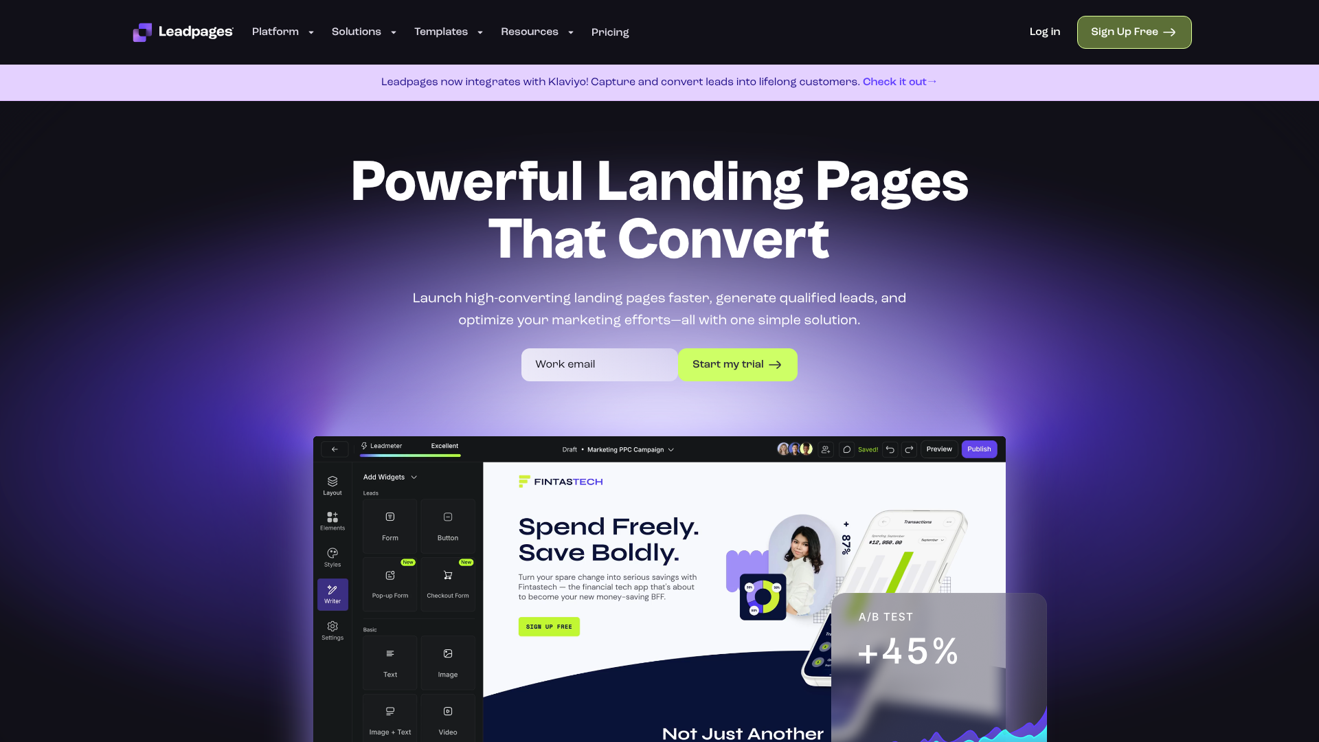
Leadpages is known for its clean, modern templates and its focus on conversion rate optimisation. It’s a great choice if your project’s goal is to collect leads or drive a specific action.
ClickFunnels is a more all-in-one platform designed for building entire marketing funnels, but its page builder is also powerful for creating standalone front pages. It’s ideal for projects that have a sales or marketing component.
Using a tool like these can save you countless hours and help you achieve a result that looks like it was made by a professional designer.
Inspiration Gallery: Examples of Stunning Project Front Pages
Sometimes the best way to get started is to see what others have done. Looking at examples of effective front page designs can spark ideas and help you identify the aesthetic you want to achieve for your own project. Here are a few popular styles to consider.
1. The Minimalist Aesthetic
Minimalism is all about “less is more.” This style uses a very limited colour palette (often monochromatic), a lot of white space, and simple, clean typography. The focus is on the most essential content. Imagine a portfolio front page with just a name in a bold sans-serif font, a one-sentence title, and a single, high-impact background image. This approach feels modern, confident, and sophisticated.
2. The Bold & Brutalist Aesthetic
Brutalism in web design is characterised by raw, exposed structures, bold and often clashing colours, and heavy, blocky typography. It’s a style that rejects traditional notions of beauty in favour of a raw, unapologetic look. A brutalist front page might feature a stark black background, oversized text in a monospaced font, and no decorative elements. It’s a challenging style but can be incredibly effective for creative or avant-garde projects that want to make a strong statement.
3. The Organic & Natural Aesthetic
This style draws inspiration from nature. It uses earthy colour palettes (browns, greens, tans), soft and natural-feeling textures, and often features high-quality photography of landscapes or natural elements. The typography might be a mix of a clean sans-serif and an elegant serif or script font. This aesthetic is perfect for projects related to wellness, sustainability, or any brand that wants to feel grounded and authentic.
4. The Corporate & Clean Aesthetic
This is a classic, professional look that prioritises clarity, trust, and order. It typically uses a conservative colour palette, often centred around blue or grey, with a single bright accent colour. The layout is highly organised, usually based on a strict grid, with clean lines and plenty of white space. The typography is almost always a crisp, legible sans-serif font. This is the go-to style for business reports, financial proposals, and tech company websites.
Frequently Asked Questions
What makes a front page design aesthetic?
An aesthetic front page design is the result of applying core design principles effectively. It’s not just about one element but how they all work together. Key factors include a harmonious colour palette that sets the right mood, clean and legible typography arranged in a clear hierarchy, and a balanced layout that uses white space to guide the eye and prevent clutter. Ultimately, an aesthetic design feels intentional, organised, and visually pleasing.
How do I make my project attractive?
To make your project attractive, start with a solid foundation. First, define the mood and message you want to convey, and choose a colour palette and fonts that align with it. Second, create a strong visual hierarchy by making your most important element (the title) the most prominent. Use high-quality images that are consistent in style, and don’t be afraid to use plenty of white space to give your design room to breathe.
Consistency is key; repeating colours, fonts, and spacing throughout creates a polished, professional look.
How to create a front page for a project?
Creating a front page involves a few simple steps. First, plan your content: what is the title, subtitle, and any other essential information. Second, choose your tools, whether it’s a simple word processor, a design tool like Canva, or a landing page builder like Leadpages. Third, create your design by applying the principles of colour, typography, and layout.
Finally, review and refine your design. Ask for feedback to see if your message is clear and the design is visually appealing.
What are common front page design mistakes?
Some of the most common mistakes include cluttering the page with too much information, which overwhelms the viewer. Another is using too many different fonts or colours, which creates a chaotic and unprofessional look. Poor typography choices, like using fonts that are hard to read or text that is too small, can also ruin a design. Lastly, a major mistake in digital projects is ignoring mobile responsiveness, resulting in a poor experience for a large portion of users.
Final Thoughts
Crafting an aesthetic front page design for a project is an achievable goal for anyone, regardless of their artistic background. It’s a skill built on understanding a few fundamental principles: balance, contrast, hierarchy, and consistency. By being intentional with your choices in colour, typography, and layout, you can create a front page that is not only beautiful but also highly effective at communicating your message.
Remember that design is a process of refinement. Your first attempt may not be perfect, and that’s okay. Use the guidelines in this article as your starting point, experiment with different ideas, and don’t be afraid to keep things simple. A clean, organised design with plenty of white space will almost always be more successful than one that is overly complex and cluttered.
If you’re working on a digital project and want a powerful tool to help you build a professional front page without the steep learning curve, consider using a dedicated platform. Tools like Leadpages or ClickFunnels offer pre-built, aesthetic templates that can give you the perfect foundation to build upon, saving you time and ensuring a high-quality result.
