How to Create an Aesthetic Front Page Design for Your Project: A Practical Guide
The front page of any project, whether it's a website, a portfolio, or a report, is your digital handshake. It’s the first impression that can either captivate your audience or cause them to click away. Creating an effective and aesthetic front page design for your project isn't just about making something look good; it's about communicating purpose, building trust, and guiding the user on a clear journey. It's the art and science of blending visual appeal with functional clarity.
- What You'll Learn
- What Does 'Aesthetic' Mean in Front Page Design?
- The Core Building Blocks of a Creative Front Page Layout
- Harnessing Colour Psychology for Impact
- Typography That Speaks Volumes
- Using Visuals to Tell Your Story
- Designing for Intuitive Navigation
- Infusing Your Brand into the Design
- Mastering Responsive Design for Every Screen
- Modern Front Page Design Aesthetics: 2024 Trends
- Inspiration Corner: Great Front Page Designs in Action
- Frequently Asked Questions (FAQ)
- How do I make an attractive front page for a project?
- What are common front page design mistakes?
- What are the 7 rules of graphic design?
- How can I make my project creative?
- Final Thoughts
Many people believe that achieving a professional look requires years of design experience or expensive software, but that's not always the case. By understanding a few core principles of visual design—from colour psychology to typography and layout—you can craft a front page that is both beautiful and effective. This guide will walk you through the essential steps and concepts needed to transform your project's entrance from mediocre to memorable.
What You'll Learn
- Aesthetics are Functional: A great design is more than just looks; it's a strategic blend of balance, colour, and typography that serves a clear purpose and guides the user.
- Hierarchy is Key: A well-defined visual hierarchy, created through size, colour, and placement, is crucial for directing the user's attention to the most important information first.
- Responsive Design is Non-Negotiable: Your front page must provide an excellent experience on all devices, from desktops to mobile phones. A mobile-first approach is essential for modern projects.
- Consistency Builds Trust: Maintaining a consistent brand identity through colours, fonts, and tone across your front page establishes credibility and makes your project look more professional.
- Tools Can Simplify the Process: You don't need to be a coding expert. Modern landing page builders offer powerful tools and templates to help you implement these design principles efficiently.
What Does 'Aesthetic' Mean in Front Page Design?
When we talk about front page design aesthetics, we're referring to the principles of beauty and artistic taste that govern a design's appearance and feel. However, in the context of a project or website, aesthetics go far beyond simple decoration. It’s about creating a cohesive and pleasing experience that communicates a specific message or feeling to the user. An aesthetic design is one where every element feels intentional and works in harmony with the others.
This harmony is achieved through several key concepts. Balance is one of the most important; it refers to the distribution of visual weight on the page. A design can have symmetrical balance for a formal, stable feel, or asymmetrical balance for a more dynamic and modern look. Both can be effective, but the choice should align with your project's goals and personality.
An unbalanced page can feel chaotic and unprofessional, immediately turning users away.
Another critical component is visual flow. A good aesthetic design guides the viewer's eye naturally through the content, from the most important element (like a headline) down to secondary information and finally to a call-to-action. This is often achieved through a strong visual hierarchy, where size, colour, and placement signal importance. The goal is to create a visual narrative that is easy and intuitive to follow, ensuring the user understands the purpose of the page without conscious effort.
The Core Building Blocks of a Creative Front Page Layout

Every effective front page, regardless of its specific style, is built from a set of fundamental components. Understanding these building blocks is the first step toward creating a creative front page layout that not only looks great but also functions perfectly. Think of these as the essential ingredients you need before you start cooking.
First and foremost is the Headline. This is typically the largest text on the page and its job is singular: to grab attention and clearly state what the project is about or what problem it solves. It needs to be concise, compelling, and instantly understandable. Directly supporting it is the Sub-headline, which offers a brief, one-to-two-sentence explanation to provide more context or highlight a key benefit.
Next is the primary Visual Element. This could be a high-quality photograph, a custom illustration, a product mockup, or even a short video. The hero image or video is often the first thing a user's eye is drawn to, and it sets the emotional tone for the entire page. It must be relevant, high-resolution, and aligned with your brand's message.
Below this, you'll often find the Call-to-Action (CTA), a button or link that prompts the user to take the next desired step, such as “Learn More,” “Sign Up,” or “Download Now.” The CTA must be visually distinct and use action-oriented language.
Finally, Social Proof elements like testimonials, client logos, or case study snippets build trust and credibility. Seeing that others have had a positive experience with your project or brand can significantly influence a new user's perception. Arranging these core elements in a logical and visually appealing way forms the foundation of any successful front page design.
Harnessing Colour Psychology for Impact
Colour is one of the most powerful tools in a designer's arsenal. It evokes emotion, draws attention, and can influence user behaviour in subtle yet profound ways. A well-thought-out colour palette is central to achieving a strong project aesthetic design. It’s not about picking your favourite colours, but about selecting hues that align with your brand's personality and resonate with your target audience.
A common and effective technique for building a palette is the 60-30-10 rule. This rule suggests that 60% of your design should be a dominant, primary colour, 30% should be a secondary colour that provides contrast and visual interest, and the final 10% should be an accent colour. The accent colour is typically the boldest and is used sparingly for key elements you want to stand out, like CTA buttons or important links. This structured approach prevents the design from becoming visually overwhelming and creates a sense of balance.
Understanding the psychological associations of colours is also vital. For example, blue often conveys trust, security, and professionalism, making it a popular choice for tech and financial companies. Green is associated with nature, growth, and health, while red can signify excitement, urgency, or passion. When choosing your palette, consider the message you want to send.
Do you want your project to feel energetic and bold, or calm and trustworthy. Your colour choices will play a huge role in shaping that perception.

Typography That Speaks Volumes
Typography is the art of arranging text to make it legible, readable, and appealing when displayed. It's a silent communicator that can dramatically affect the overall front page design aesthetics. Good typography goes unnoticed because it feels natural and effortless to read, whereas bad typography is immediately jarring and can make even the best content inaccessible.
One of the first decisions is choosing your fonts. A common practice is to pair a serif font (with small lines attached to the end of strokes, like Times New Roman) with a sans-serif font (without those lines, like Arial or Helvetica). For example, you might use a bold, elegant serif for headlines to convey tradition and authority, and a clean, simple sans-serif for body text to ensure maximum readability. Limiting your design to two, or at most three, fonts is crucial for maintaining a clean and uncluttered look.
Once you've chosen your fonts, establishing a clear typographic hierarchy is the next step. This means defining distinct styles for your different text elements—H1 for main headings, H2 for subheadings, and paragraph text for the body. Headings should be significantly larger and perhaps bolder than body text to create a clear visual distinction. This hierarchy helps users scan the page quickly, understand the structure of the information, and find what they are looking for without having to read every word.
Pay attention to details like line height (the space between lines of text) and letter spacing to further enhance readability.
Pro Tip: Use online tools like Google Fonts to browse and pair fonts easily. Many of these tools show you popular pairings and allow you to preview how your headline and body text will look together, taking much of the guesswork out of the process.
Using Visuals to Tell Your Story
Visual elements like images, illustrations, and icons are essential for creating an engaging and aesthetic front page design for your project. They break up text, add personality, and can communicate complex ideas much faster than words alone. The right visuals can capture a user's attention instantly and create an emotional connection that text often cannot.
When selecting images, authenticity is key. Stock photos can be useful, but they often look generic and can detract from your project's credibility. Whenever possible, use high-quality, original photography that showcases your product, team, or customers. If you must use stock photos, choose images that look natural and align closely with your brand's unique style.
Illustrations and icons are another fantastic option for adding a custom feel and simplifying complex information into easily digestible visuals.
It's not just about the visuals themselves, but how you use them. White space, or negative space, is the empty area around your images and text. Giving your visual elements ample breathing room is critical. A cluttered page with too many elements packed together feels overwhelming and confusing.
Strategic use of white space creates a sense of calm and sophistication, improves focus, and helps guide the user's eye towards the most important parts of your design. Remember, sometimes what you don't include is just as important as what you do.
For a great overview of front page design ideas, this video offers some excellent visual inspiration:
Designing for Intuitive Navigation
An aesthetically pleasing front page can be rendered useless if users can't figure out where to go or how to find information. A user-friendly navigation experience is a cornerstone of effective design. The goal is to make moving through your project so intuitive that the user doesn't even have to think about it. The structure should be logical, predictable, and consistent.
Your main navigation menu should be simple and clear. Limit the number of top-level menu items to the absolute essentials—typically between four and seven. Use straightforward, descriptive labels like “About,” “Services,” and “Contact” rather than vague or clever jargon that might confuse visitors. The navigation bar should be prominently placed, usually at the top of the page, and should remain visible or easily accessible as the user scrolls.
Beyond the main menu, your on-page navigation matters too. This includes the logical flow of content and the placement of internal links and buttons. Your creative front page layout should guide the user on a predefined path. For example, a compelling headline should lead to an informative paragraph, which then directs the user to a clear call-to-action.
Every element should have a purpose and contribute to helping the user complete their goal, whether it's learning about your project or making a purchase.
Infusing Your Brand into the Design
Your front page is often the first point of contact a person has with your brand, making it a critical opportunity to establish your identity. A strong brand identity goes beyond just a logo; it’s the cohesive story told through your colours, fonts, imagery, and tone of voice. Integrating this identity consistently is what elevates a generic design into a memorable brand experience.
Start with your logo. It should be placed in a prominent position, typically in the top-left corner of the page, as this is where users instinctively look first. Your brand's colour palette, as discussed earlier, should be used consistently across all elements, from button colours to headline text. This repetition reinforces brand recognition and creates a polished, professional appearance.
The same goes for your typography; use your chosen brand fonts consistently for all headings and body text.
The imagery and language you use are just as important. The photos or illustrations on your front page should reflect your brand's personality. Are you playful and creative, or serious and corporate. The visuals should match.
Similarly, the copy—from the main headline to the button text—should speak in your brand's unique voice. This consistent application of your brand identity across all touchpoints is what builds trust and makes your project feel authentic and cohesive.
Mastering Responsive Design for Every Screen
In today's multi-device world, it's a certainty that your audience will view your project on a variety of screen sizes, from wide-screen desktop monitors to small mobile phones. Responsive design is the practice of ensuring your front page looks and functions perfectly on all of them. It is no longer an optional extra; it is an absolute necessity for any modern aesthetic front page design for project.
A responsive design automatically adjusts its layout, image sizes, and typography to fit the screen it's being viewed on. A multi-column layout on a desktop might stack into a single, scrollable column on a mobile device. Text might become larger to improve readability on a smaller screen. The core principle is to provide an optimal user experience regardless of the device.
A page that forces mobile users to pinch and zoom to read text is a page that will be quickly abandoned.
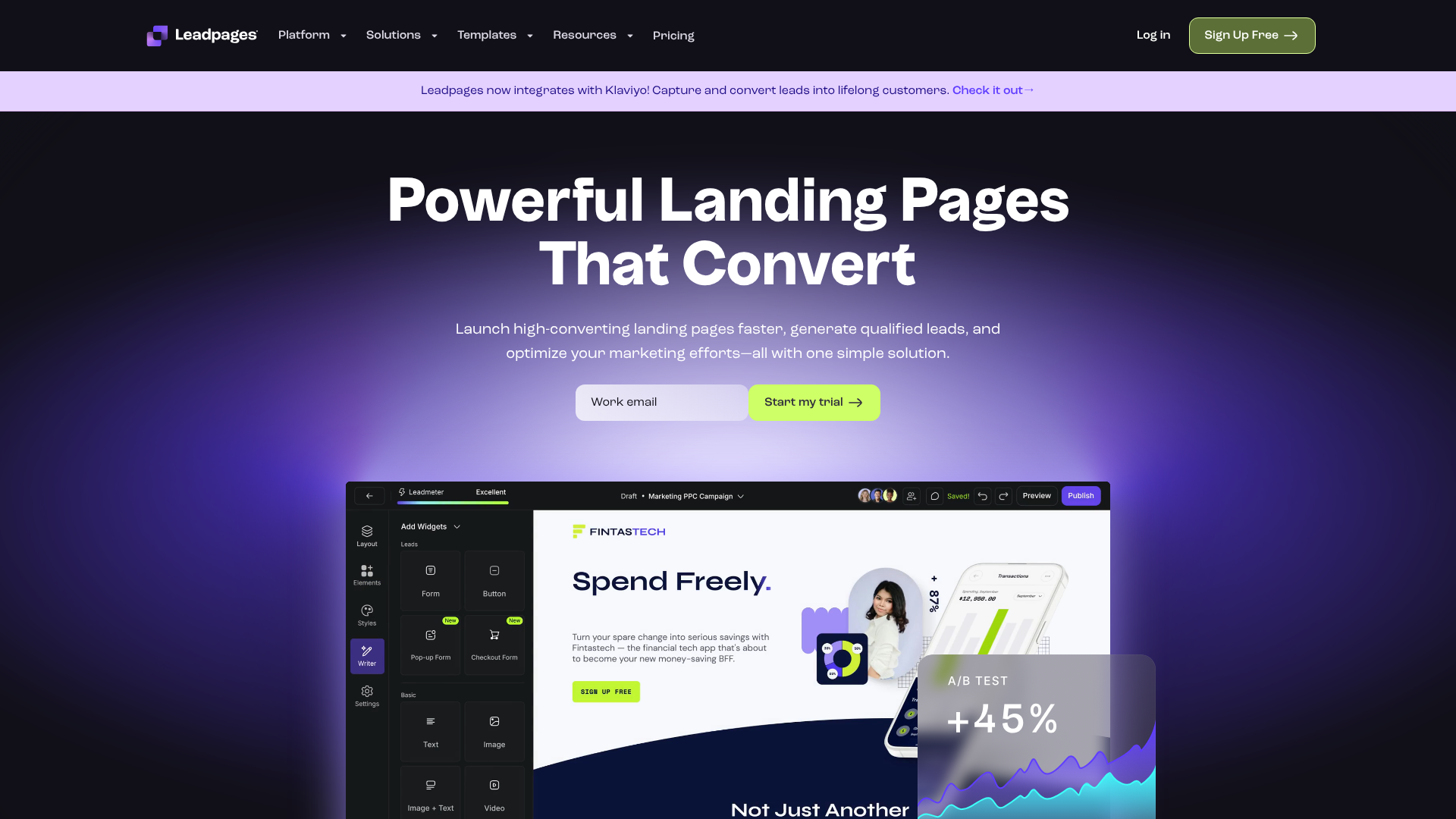
This is an area where modern tools can be incredibly helpful. Instead of writing complex code to handle every possible screen size, landing page builders like Leadpages or Unbounce are built with responsiveness at their core. They offer templates that are already optimized for mobile and provide visual editors that let you preview and fine-tune your design for different devices. This allows you to focus on the creative aspects of your design, confident that the technical foundation is solid and will provide a great experience for all users.
Modern Front Page Design Aesthetics: 2024 Trends
While the core principles of good design are timeless, visual trends are always evolving. Being aware of current trends can help your project feel fresh, modern, and relevant. Incorporating some of these ideas can add a contemporary flair to your front page design aesthetics, though it's important to choose trends that align with your brand and don't compromise usability.
One major trend is Minimalism and Clean Design. This approach focuses on simplicity, abundant white space, and a limited colour palette. By removing unnecessary clutter, you place the focus squarely on your most important content and create a calm, elegant user experience. Another popular trend is Dark Mode, which uses a dark background with light text.
It's easier on the eyes in low-light conditions and can make colours and visuals pop, creating a bold, sophisticated look.
Glassmorphism is another aesthetic gaining traction. This effect mimics the look of frosted glass, creating a semi-transparent background that adds depth and a futuristic feel to UI elements. We're also seeing a rise in Interactive and Animated Elements, such as micro-interactions (small animations when a user clicks a button), scroll-triggered animations, and interactive 3D graphics. When used thoughtfully, these elements can make the user experience more engaging and delightful.
However, it's crucial to ensure they don't slow down your page's loading time or distract from your main message.
Pro Tip: Don't chase every trend. The best approach is to blend timeless design principles with one or two modern trends that genuinely enhance your project's message and user experience. The goal is to be current, not just trendy.
Inspiration Corner: Great Front Page Designs in Action
Theory is helpful, but seeing principles applied in the real world is often the best way to learn. Let's break down a few examples of successful front page designs and identify why they work so well, offering inspiration for your own project aesthetic design.
Example 1: The SaaS Product Page
Imagine a front page for a project management tool. It opens with a clear, benefit-driven headline: “Organise Your Chaos. Achieve Your Goals.” The sub-headline quickly explains, “Our intuitive platform helps teams plan, track, and deliver projects on time.” The hero visual is a clean, animated GIF showing the software in action, instantly demonstrating its value. The colour palette is dominated by a trustworthy blue, with a vibrant green accent colour for the “Start Your Free Trial” CTA button, making it impossible to miss.
The layout is clean and uses plenty of white space, guiding the user down to sections featuring client logos (social proof) and key features explained with simple icons.
Example 2: The Creative Portfolio
A graphic designer's portfolio front page might take a more minimalist and visual approach. The headline could be just the designer's name in a unique, custom font. The main visual is a dynamic grid of their best work. As the user hovers over each project, a smooth animation reveals the project title.
The navigation is stripped back to just “Work,” “About,” and “Contact.” The colour scheme is monochromatic, using shades of grey and black to ensure the colourful portfolio pieces are the main focus. This design communicates creativity and confidence through its simplicity and focus on the work itself.
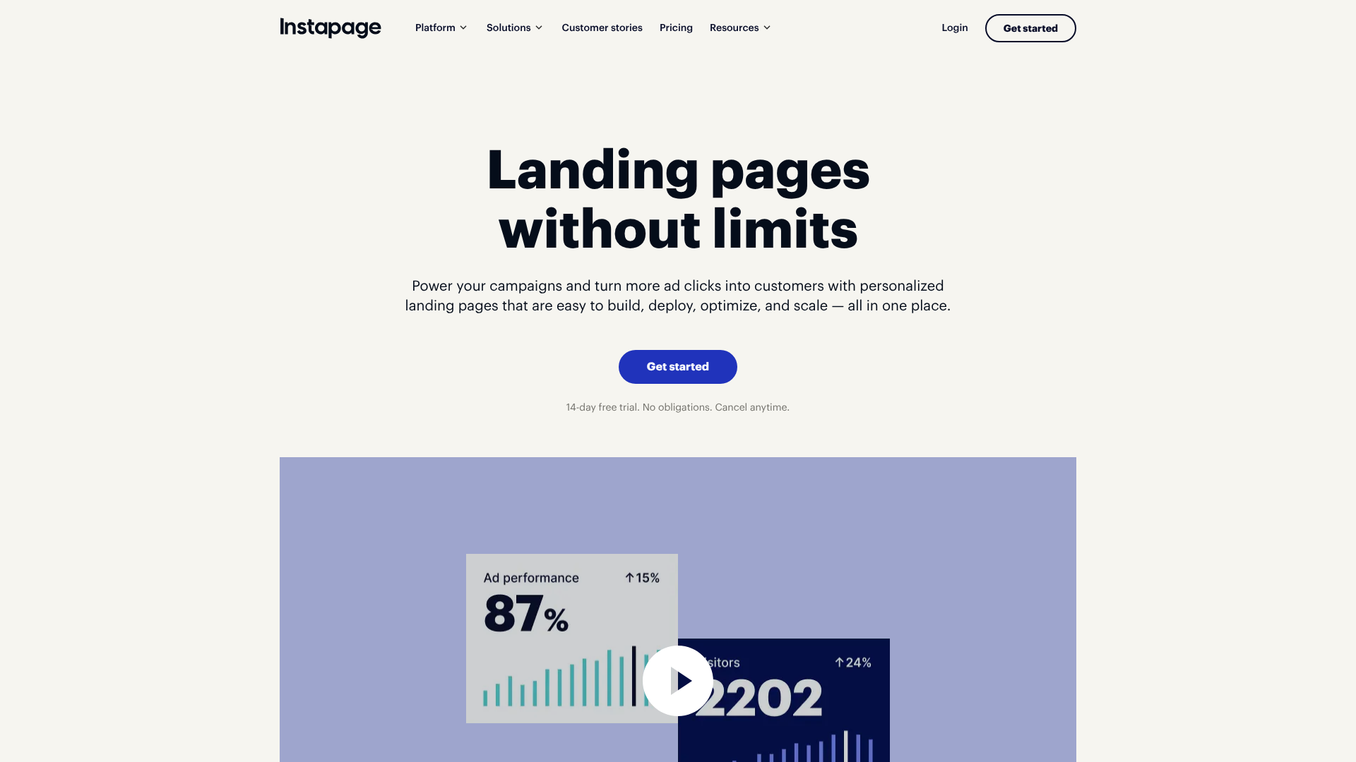
These kinds of polished, high-converting pages don't always require a full development team. Platforms like Instapage and ClickFunnels are specifically designed to help users build visually stunning and effective front pages using drag-and-drop editors and proven templates, making professional design more accessible to everyone.
Frequently Asked Questions (FAQ)
How do I make an attractive front page for a project?
Making an attractive front page involves a combination of several key elements. Start with a strong visual hierarchy to guide the user's eye. Use a clean layout with plenty of white space to avoid a cluttered look. Choose a limited and harmonious colour palette that reflects your brand's personality, and select clean, readable typography with a clear distinction between headings and body text.
Finally, ensure all your visual elements, like photos and icons, are high-quality and relevant to your message.
What are common front page design mistakes?
Some of the most common mistakes include a cluttered layout with too much information, a weak visual hierarchy where nothing stands out, and poor colour contrast that makes text difficult to read. Other major errors are using low-quality or irrelevant images, having a confusing navigation menu, and neglecting responsive design, which results in a poor experience on mobile devices. A slow page load time, often caused by unoptimized images, is another critical mistake that will drive users away quickly.
What are the 7 rules of graphic design?
While different designers might have slightly different lists, the seven most widely accepted principles of graphic design are fundamental to creating an aesthetic front page. They are: Hierarchy (making important elements stand out), Balance (distributing visual weight), Contrast (using differences to create emphasis), Repetition (reusing elements to create unity), Proximity (grouping related items together), Alignment (creating a sharp, ordered appearance), and White Space (the empty space that gives elements room to breathe).
How can I make my project creative?
To make your project's front page more creative, step beyond generic templates. Consider using a unique visual element like a custom illustration, a bold typographic treatment for your headline, or subtle animations that engage the user. You can also experiment with an unconventional layout, such as an asymmetrical design, or a bold colour palette. The key is to ensure your creative choices still serve the page's main goal and don't sacrifice usability for the sake of being different.
Storytelling through your copy and visuals is another powerful way to create a memorable and creative experience.
Final Thoughts
Crafting an aesthetic front page design for your project is an achievable goal for anyone, regardless of their technical skill level. By focusing on the fundamental principles of visual communication—balance, hierarchy, colour, typography, and user experience—you can create a digital front door that is both welcoming and effective. Remember that good design is not about adding more; it's often about being intentional and removing anything that doesn't serve a purpose.
Start by defining your project's goal and understanding your audience. Use that knowledge to build a clear structure with the core elements, and then layer on your brand's unique personality through a thoughtful selection of colours, fonts, and imagery. Most importantly, never forget the end-user; a design is only successful if it provides a seamless and intuitive experience on every device.
If you're ready to bring your vision to life without getting bogged down in code, exploring a landing page builder can be a great next step. Tools like Leadpages and Unbounce provide the templates and flexibility to implement these design principles quickly and efficiently, empowering you to create a beautiful and high-performing front page.
