A Simple Front Page Design That Converts: Your Step-by-Step Guide
Your website's front page is your digital handshake. It’s the first thing visitors see, and you have mere seconds to make a good impression. A cluttered, confusing homepage can send potential customers clicking away before they even understand what you offer. The solution isn't more features or flashier animations; it's clarity and focus.
- What You'll Learn
- Why a Minimalist Website Design is More Effective
- Choosing a Simple and Effective Colour Palette
- The Core Components of a Basic Front Page Layout
- The Hero Section: Your First Impression
- The Call-to-Action (CTA): Guiding the User
- Social Proof: Building Trust
- The Footer: Essential Information
- Typography That Speaks Volumes (Quietly)
- Crafting Clear and User-Friendly Navigation
- Using Images and Graphics for Maximum Impact
- Responsive Design: Ensuring a Great Experience on Every Device
- Weaving Your Brand into Your Homepage Design
- Common Mistakes to Avoid in Your Easy Homepage Design
- Tools and Resources for Your Simple Front Page Design
- FAQ about Front Page Design
- What makes a good front page?
- How do I make my homepage look professional?
- What is the most important element on a homepage?
- How much text should be on a front page?
- Final Thoughts
This guide will show you how to create a simple front page design that not only looks professional but also effectively guides users and boosts conversions.
Many businesses mistakenly believe that a complex design equals a more valuable website. The opposite is often true. An easy homepage design reduces cognitive load, allowing visitors to quickly find what they need. By focusing on the essentials, you create a more powerful and persuasive user experience.
We'll cover everything from layout and colour to the tools that can help you build it without writing a single line of code.
What You'll Learn
- Simplicity is Strategic: A minimalist approach is not about being boring; it's about improving user focus, increasing loading speed, and making your message clearer.
- Hierarchy is Everything: A well-defined visual hierarchy, using size, colour, and placement, is crucial for guiding users to your most important call-to-action (CTA).
- The Power of Space: Strategic use of colour, clean typography, and abundant white space work together to build a professional, trustworthy, and aesthetically pleasing experience.
- Responsive Design is Non-Negotiable: Your front page must provide a seamless experience on all devices, from desktops to mobile phones, to capture every potential lead.
- Tools Make it Easy: You don't need to be a professional designer or developer. Modern tools can help you create a stunning front page with drag-and-drop simplicity.
Why a Minimalist Website Design is More Effective
A minimalist website design philosophy is built on the idea that less is more. This isn't about stripping your site of personality; it's about removing distractions to highlight your core message. When a user lands on your front page, they have a goal. A simple design helps them achieve that goal faster, whether it's signing up for a newsletter, learning about your service, or making a purchase.
One of the most significant benefits is improved user experience (UX). With fewer elements competing for attention, visitors can easily navigate your site and find the information they're looking for. This clarity reduces frustration and bounce rates. A clean layout feels intuitive and accessible, which builds subconscious trust with your audience.
Think of it like a well-organised physical shop versus a cluttered one; you're more likely to stay and browse in the former.
Furthermore, simplicity directly impacts performance. Websites with fewer elements, smaller images, and cleaner code load significantly faster. In an age of dwindling attention spans, page speed is a critical ranking factor for search engines like Google and a major factor in user retention. A one-second delay in page load time can result in a 7% reduction in conversions.
A simple design is one of the most effective ways to ensure your site is fast and responsive, keeping both users and search engines happy.

Choosing a Simple and Effective Colour Palette
Colour is a powerful communication tool that evokes emotion and sets the tone for your brand. For a simple front page design, the goal is to use colour purposefully, not just decoratively. A limited and consistent colour palette creates visual harmony and reinforces your brand identity without overwhelming the user.
A widely used principle in design is the 60-30-10 rule. This framework provides a simple way to create a balanced and professional colour scheme. It works like this:
- 60% Primary Colour: This is your dominant hue and will cover the most visual space. It's often a neutral colour like white, light grey, or a muted brand colour that serves as the background.
- 30% Secondary Colour: This colour is used to create contrast and visual interest. It should complement your primary colour and is often used for secondary elements like subheadings or content blocks.
- 10% Accent Colour: This is your most vibrant colour, reserved for key elements you want to stand out, such as call-to-action buttons, links, or important icons. It should contrast sharply with the primary and secondary colours to draw the eye.
When selecting your colours, consider their psychological impact. Blue often conveys trust and professionalism, making it popular for tech and financial companies. Green is associated with growth, nature, and health. Red creates a sense of urgency and excitement, which is why it's often used for sales and clearance buttons.
Your palette should align with your brand's personality and the message you want to convey. Tools like Coolors or Adobe Color can help you generate professional palettes that are aesthetically pleasing and accessible.
The Core Components of a Basic Front Page Layout
An effective front page isn't just a random collection of elements; it's a strategically organised layout designed to guide the user on a journey. A basic front page layout focuses on a few key components that work together to inform, persuade, and convert.
The Hero Section: Your First Impression
The hero section is the large area at the top of your homepage that users see without scrolling. It's your most valuable real estate. It must immediately answer three questions for the visitor: Who are you. What do you do.
What can I do here. A successful hero section contains:.
- A Compelling Headline: A short, benefit-driven statement that grabs attention and communicates your main value proposition.
- A Supporting Subheading: A brief sentence or two that elaborates on the headline and provides more context.
- A Primary Call-to-Action (CTA): A clear, prominent button that tells users the single most important action you want them to take (e.g., "Start Free Trial," "Shop Now").
- High-Quality Visuals: A relevant, professional image or short video that supports your message and connects with your target audience.
The Call-to-Action (CTA): Guiding the User
While the hero section has your primary CTA, you should strategically place other CTAs throughout the page. Every section of your homepage should have a purpose, and that purpose often leads to a specific action. Use contrasting colours for your CTA buttons to make them stand out. The text on the button should be action-oriented and clear, such as "Learn More," "Download the Guide," or "Request a Demo." Avoid vague terms like "Click Here" or "Submit."
Social Proof: Building Trust
New visitors are naturally sceptical. Social proof is essential for overcoming this hesitation and building trust. It shows that other people have used and valued your product or service. Common forms of social proof on a front page include:
- Customer Testimonials: Short quotes from happy customers, complete with their name and photo for added authenticity.
- Logos of Known Clients: Displaying the logos of well-known companies you've worked with.
- Awards and Badges: Any industry recognition or security badges that add credibility.
- User Numbers or Ratings: Metrics like "Trusted by 50,000+ users" or star ratings from review sites.
The Footer: Essential Information
The footer is the section at the very bottom of your page. While often overlooked, it's where users expect to find important logistical information. A well-organised footer should include links to your contact page, about page, privacy policy, terms of service, and social media profiles. It provides a final navigation point for users who have scrolled to the end of the page.
Typography That Speaks Volumes (Quietly)
Typography is the art of arranging text to make it legible, readable, and appealing. In a minimalist design, where text carries a lot of weight, your font choices are critical. Good typography enhances your message and contributes to a clean, professional aesthetic, while poor typography can make your site look amateurish and difficult to read.
First, limit your font selection. Using more than two or three different fonts can create visual chaos. A common and effective strategy is to use one font for headings (a serif or a bold sans-serif) and another for body text (typically a clean, highly legible sans-serif). This contrast helps establish a clear visual hierarchy, making the content easy to scan.
Google Fonts offers a vast library of free, high-quality web fonts that are easy to implement.
Readability is the top priority. Ensure your body text is large enough to be read comfortably on all devices—a font size of 16px is a good starting point. Pay attention to line height (the space between lines of text); a line height of around 1.5 times the font size generally improves readability. Also, keep your line length in check.
Lines that are too long or too short can strain the reader's eyes. An ideal line length is between 50 and 75 characters.
Pro Tip: Use font weight and style (e.g., bold, italic) to create emphasis and hierarchy without introducing new fonts. A bolded subheading or an italicised quote can guide the reader's eye and break up long blocks of text, all while maintaining a consistent and clean look.
Crafting Clear and User-Friendly Navigation
Your website's navigation is the roadmap that guides visitors through your content. For an easy homepage design, the navigation should be simple, intuitive, and predictable. If users can't figure out how to get around your site, they will leave. The main navigation menu, typically located in the header, should be concise and use clear, descriptive labels.
Limit the number of top-level menu items. A cluttered menu with too many options can cause decision paralysis. Aim for five to seven main items at most. Use simple, one-or-two-word labels that accurately describe the content of the linked page.
For example, use standard terms like "About," "Services," "Pricing," and "Contact" instead of vague or clever phrases that might confuse users.
Ensure your navigation is consistent across your entire website. The menu should appear in the same location on every page, reinforcing a sense of familiarity and making it easy for users to find their way back. Your company logo, usually placed in the top-left corner of the header, should always link back to the front page. This is a universally understood web convention that users expect.
Finally, consider the user's journey. Your navigation should be organised logically, reflecting the priorities of your visitors. Place the most important links, like "Services" or "Products," at the beginning of the menu (on the left) and less critical links, like "About Us" or "Blog," towards the end. A well-structured navigation system is a cornerstone of a positive user experience.
Using Images and Graphics for Maximum Impact
Visuals are a crucial part of a simple front page design, but they must be used with intention. Every image and graphic should have a purpose, whether it's to illustrate a point, evoke an emotion, or showcase your product. High-quality, professional visuals can make your site look more credible and engaging, while low-quality or irrelevant images can have the opposite effect.
Choose images that are authentic and relevant to your brand. Avoid generic stock photos that feel impersonal and disconnected from your message. If possible, use professional photos of your actual team, products, or customers. This authenticity helps build a stronger connection with your audience.
Ensure all images are optimised for the web to keep your page loading quickly. You can use tools like TinyPNG to compress image files without sacrificing significant quality.
Icons are another excellent way to add visual interest and improve scannability without adding clutter. They can be used to represent different services, features, or benefits in a visually concise way. Use a consistent icon style throughout your page to maintain a cohesive look. Simple, line-art icons often work best for a minimalist aesthetic.
Remember that the most important visual element is often the absence of them: white space. White space (or negative space) is the empty area around elements on your page. It's not wasted space; it's an active design element that reduces clutter, improves readability, and helps focus the user's attention on the most important content. Don't be afraid to give your text and images room to breathe.
Responsive Design: Ensuring a Great Experience on Every Device
In today's multi-device world, responsive design is no longer optional; it's essential. A responsive website automatically adjusts its layout to fit the screen size of the device it's being viewed on, whether it's a wide-screen desktop monitor, a laptop, a tablet, or a mobile phone. More than half of all web traffic now comes from mobile devices, so if your front page isn't mobile-friendly, you're alienating a huge portion of your audience.
Google also uses mobile-friendliness as a significant ranking factor in its search results. A site that is not optimised for mobile will likely rank lower than its responsive competitors. This means that a non-responsive design not only creates a poor user experience but also directly harms your SEO efforts.
When designing your front page, adopt a "mobile-first" mindset. This means you start by designing the layout for the smallest screen (a mobile phone) and then work your way up to larger screens. This approach forces you to prioritise the most essential content and features, which naturally leads to a cleaner and more focused design across all devices. Key considerations for mobile design include:
- Readable Text: Ensure font sizes are large enough to be read on a small screen without zooming.
- Tap-Friendly Buttons: Make sure buttons and links are large enough and have enough space around them to be easily tapped with a finger.
- Simple Navigation: Use a collapsible "hamburger" menu to save space.
- Optimised Images: Use smaller image files to ensure fast loading times on mobile networks.
Weaving Your Brand into Your Homepage Design
Your front page is often the first interaction someone has with your brand, so it's crucial that it clearly communicates your brand identity. Branding goes beyond just your logo; it's the overall look, feel, and voice of your company. A consistent brand presence helps build recognition and trust.
Your logo should be prominently displayed, typically in the top-left corner of the header. This is where users expect to see it. Use your brand's colour palette consistently throughout the page, as discussed earlier. The colours you choose should reflect your brand's personality—whether it's professional and trustworthy, or fun and energetic.
Typography also plays a key role in branding. The fonts you use should be consistent with your other marketing materials and reflect your brand's style. A traditional serif font might suit a law firm, while a modern sans-serif might be better for a tech startup. Most importantly, your brand's voice and tone should be evident in all the text on the page.
From the main headline to the button text, the language should sound like it's coming from your brand, whether that's formal, casual, witty, or supportive.
Pro Tip: Create a simple brand style guide, even if it's just a one-page document. It should define your logo usage, primary and secondary colours (with hex codes), and typography choices. This ensures consistency as your website and marketing efforts grow.
Common Mistakes to Avoid in Your Easy Homepage Design
Creating a simple and effective front page is often about what you choose to leave out. Many well-intentioned designs fail because they fall into common traps. Avoiding these mistakes is just as important as following best practices.
- Vague or Missing Call-to-Action (CTA): The most common mistake is not telling visitors what to do next. Your page must have a clear, primary CTA that is visually distinct. If users don't know what the next step is, they won't take it.
- Too Much Text: Visitors don't read websites; they scan them. Large, intimidating blocks of text will be ignored. Break up your content into short paragraphs, use descriptive headings, and leverage bullet points to make information digestible.
- Ignoring the User: Your homepage should be focused on your visitor's problems and how you can solve them. Avoid using too much jargon or focusing entirely on your company's history. Frame your message around the user's needs and benefits.
- Poor Quality Imagery: Low-resolution, irrelevant, or cheesy stock photos can instantly damage your credibility. Invest in high-quality, authentic visuals that support your brand message.
- Hidden Contact Information: Don't make users hunt for a way to get in touch with you. Your contact information or a link to your contact page should be easily accessible, typically in the main navigation and the footer.
As noted in a discussion on Reddit, users appreciate when a design gets straight to the point. Overloading the page with unnecessary elements is a frequent cause of frustration.
Tools and Resources for Your Simple Front Page Design
You don't need to be a coding expert or a graphic designer to create a beautiful and effective front page. Modern website and landing page builders offer intuitive drag-and-drop interfaces that make the process accessible to everyone. These tools provide pre-designed templates that you can customise to fit your brand, saving you time and effort.
Here are a few excellent platforms that specialise in creating high-converting pages with ease:
1. Leadpages
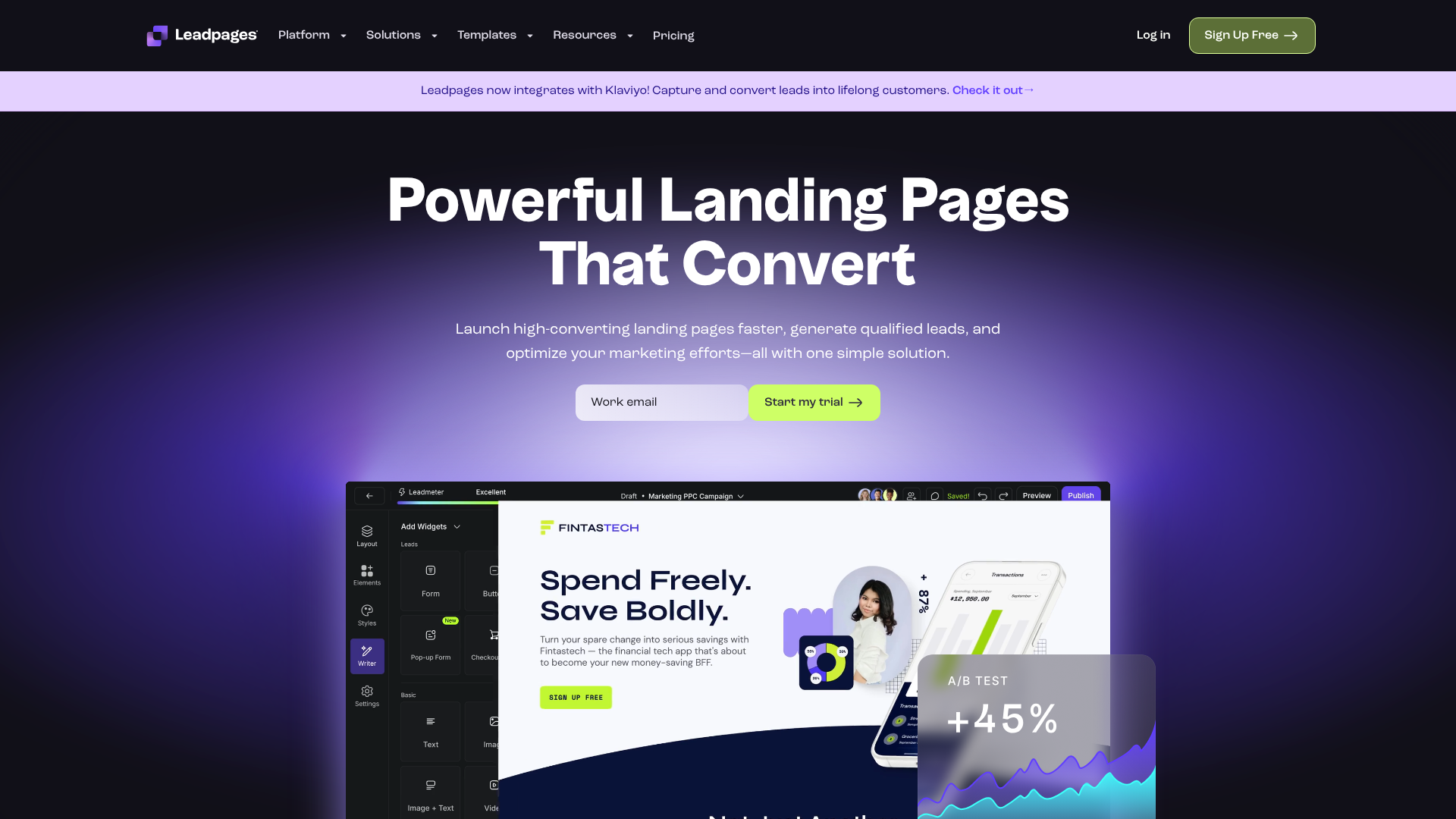
Leadpages is a fantastic tool for small businesses and entrepreneurs who need to get a professional-looking page up and running quickly. It's known for its user-friendly interface and a vast library of mobile-responsive templates designed for conversion.
Pros:
- Extremely easy-to-use drag-and-drop editor.
- Focus on conversion optimisation with features like A/B testing and built-in analytics.
- Affordable pricing plans make it accessible for smaller budgets.
Cons:
- Customisation options can be more limited compared to more advanced builders.
- Best suited for landing pages and simple sites rather than complex, multi-page websites.
2. Unbounce
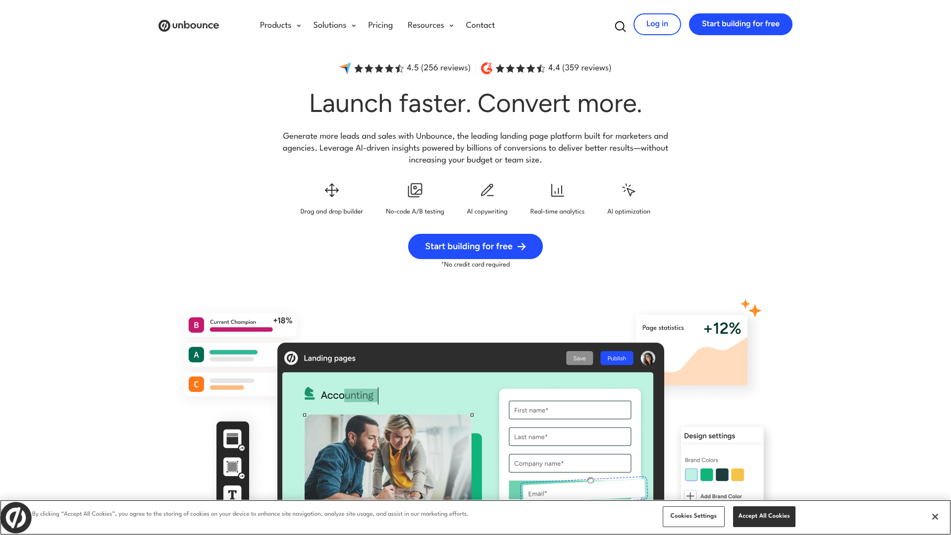
Unbounce is a powerful platform aimed at marketers who are serious about conversion rate optimisation. It offers more advanced features like Dynamic Text Replacement and robust A/B testing capabilities, allowing you to create highly personalised experiences for your visitors.
Pros:
- Advanced A/B testing and conversion intelligence tools.
- High degree of design flexibility and customisation.
- Integrates with a wide range of marketing tools.
Cons:
- Steeper learning curve compared to simpler tools.
- Higher price point, making it more suitable for established businesses.
3. Instapage
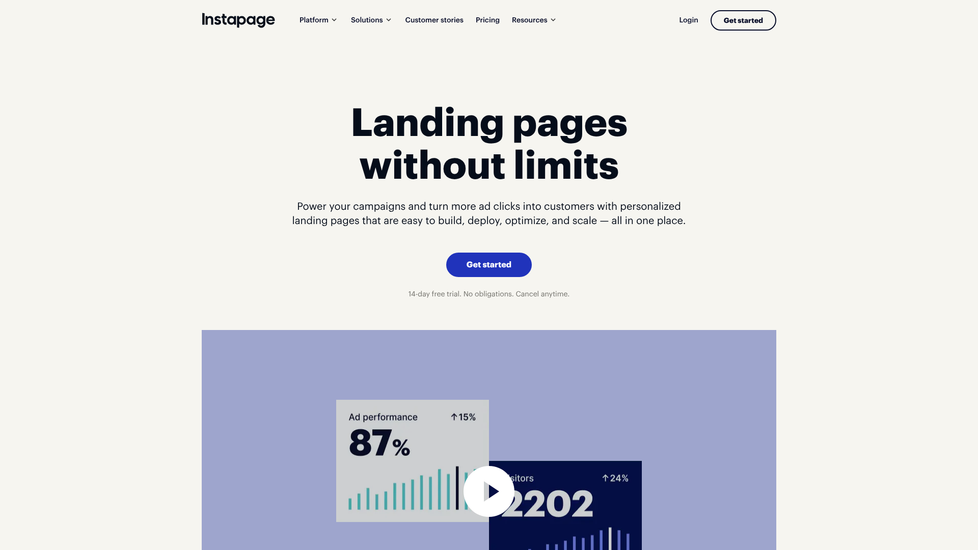
Instapage is another excellent choice, particularly for teams and agencies. It excels at creating personalised landing pages at scale and offers strong collaboration features. Its AdMap feature allows you to connect ads directly to relevant landing pages, ensuring message match and improving campaign performance.
Pros:
- Excellent personalisation and ad-to-page mapping features.
- Built-in collaboration tools for teams.
- Fast page loading speeds are a key focus of the platform.
Cons:
- It is one of the more expensive options on the market.
- The feature set might be overkill for individuals or very small businesses.
These tools empower you to implement all the principles of a simple front page design without technical barriers. They handle the responsive design, performance optimisation, and technical details, so you can focus on your message and your customers.
FAQ about Front Page Design
What makes a good front page?
A good front page is clear, focused, and user-centric. It should immediately communicate your value proposition with a compelling headline and hero image. It needs to be easy to navigate, load quickly, and have a clear call-to-action that guides the user to the next step. Ultimately, it successfully balances aesthetic appeal with functional clarity to achieve a specific business goal.
How do I make my homepage look professional?
To make your homepage look professional, focus on consistency and quality. Use a limited, harmonious colour palette and no more than two or three complementary fonts. Ensure all images are high-resolution and relevant. Abundant white space is key to avoiding a cluttered look.
Finally, a consistent layout and branding across the page will create a polished and credible appearance.
What is the most important element on a homepage?
The most important element is arguably the hero section, specifically the combination of your headline and primary call-to-action (CTA). This is the first thing visitors see, and it has the critical job of grabbing their attention, explaining what you do, and telling them what action to take. If this section fails to engage the user, the rest of the page may never be seen.
How much text should be on a front page?
There should be just enough text to communicate your message clearly and concisely, but no more. Users scan web pages, so use short paragraphs, bullet points, and clear headings. Each section should have a specific purpose and only include the text necessary to achieve it. Focus on benefits over features and write for scannability, not for a novel.
Final Thoughts
Creating a simple front page design is a powerful strategy for capturing attention and driving action in a crowded digital world. By embracing minimalism, focusing on a clear visual hierarchy, and prioritising the user experience, you can build a homepage that is both beautiful and highly effective. It’s not about having the most features; it’s about having the right ones, presented with clarity and purpose.
Remember the core principles: a clear message in your hero section, a strategic use of colour and typography, intuitive navigation, and a responsive layout that works everywhere. Avoid common pitfalls like clutter and vague calls-to-action. A simple, well-executed design builds trust, communicates professionalism, and ultimately helps you achieve your business goals.
If you're ready to build a high-converting front page without the technical headache, tools like Leadpages or Unbounce provide the templates and drag-and-drop functionality to bring your vision to life quickly and easily. Start simple, focus on your user, and let your message shine.

